Blog
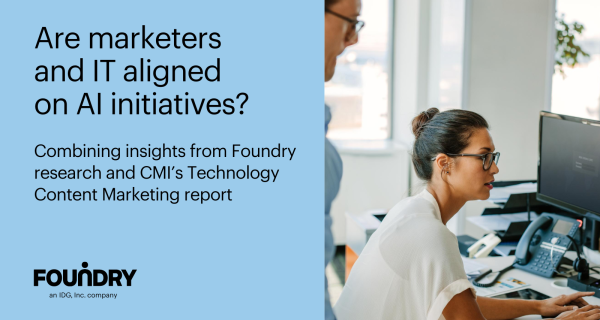
Are marketers and IT aligned on AI initiatives?
There’s no doubt that AI, especially Generative AI tools, have proven effective and efficient for a whole mix of people over the past year and a half. I’ll always remember
Thought leadership and original ideas from Foundry’s industry experts. Explore the latest trends in B2B marketing from the intersection of media and martech.
The 40-year IT veteran discusses his role and how the IT buying process is evolving at one of the world's leading manufacturers of wire and cable, tools, components, and assembled solutions. [...]
There’s no doubt that AI, especially Generative AI tools, have proven effective and efficient for a whole mix of people over the past year and a half. I’ll always remember

Even as CIOs devote time to modernization and optimization, their primary charter is as change makers championing and leading business transformation.

Sometimes you just want to see how products work. That’s the idea behind DEMO, in which technology vendors provide a “show and tell” experience of their new features or platforms, software, and hardware. Hosted by…
Discover the transformative role of the B2B CMO in driving business growth through digital experiences, AI adoption, and customer engagement.

Navigate the 'Bloomer vs. Gloomer' AI debate in marketing, uncovering practical strategies, and gaining expert insights for successful AI implementation.

Discover the latest insights from CIOs on navigating tech challenges, cybersecurity investments, and trends shaping 2024.
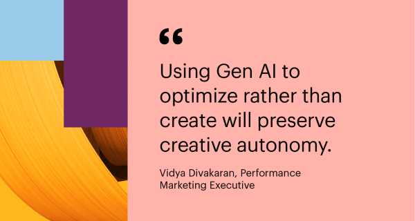
Where is the balance between Gen AI and human creativity in content creation? Explore the role of AI in shaping digital narratives.
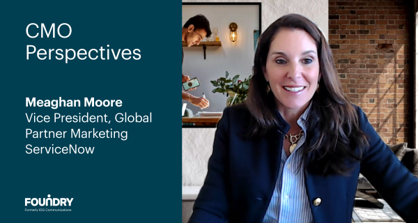
Moore shares insights on the resurgence of face-to-face events, the importance of maintaining global consistency while being locally relevant, and the significance of establishing a team founded on trust.

I recently had the pleasure of hosting a roundtable dinner discussion which included senior partner marketers from Adobe, AWS, NetApp, Outsystems, PureStorage, Salesforce and SoftwareOne . In a thought-leading discussion

AI and machine learning have been providing business value for many years, and now versions such as Generative AI have more easily brought these tools into everyday life, sparking new

By: Matt Egan and Doni Lerner Generative AI has definitely turned up the volume on inbox noise. When your competitors use Generative AI to personalize at scale and the inbox
Despite the evolving landscape of cybersecurity, the top priorities for chief information security officers (CISOs) have remained consistent over the years. The perennial focus on being prepared to respond to